Fixing things
You already know that this site isn’t perfect. That’s not an excuse, just a fact. As I notice things that are necessary but missing or things that don’t work well, I’ll be updating them.
The first thing I noticed when I pulled the site up on my iPhone was that it didn’t look good at all. This is what the table of contents looked like:
And this was the first post:
Not very readable.
So I took about fifteen minutes to add a few lines of code to make the site easier to read on smaller screens. First off, I added the viewport meta-tag to get a quick win:
<meta name="viewport" content="width=device-width">Secondly, on screens with widths less than 600 pixels, I wanted to make the font size smaller since the text was appearing way too large. As I set my font size to 1px in the html element and use rems everywhere, I was able to do this easily and also maintain the rhythm of the margins, etc., with just a single media query:
@media screen and (max-width: 600px) {
  html {
    font-size: 0.8px;
  }
}Finally*, I saw that the orange accent on the left margin which I’m creating with a CSS gradient applied as the background image to the html element was blurry on my retina display so I added a media query to set the background size on that which fixed the problem.
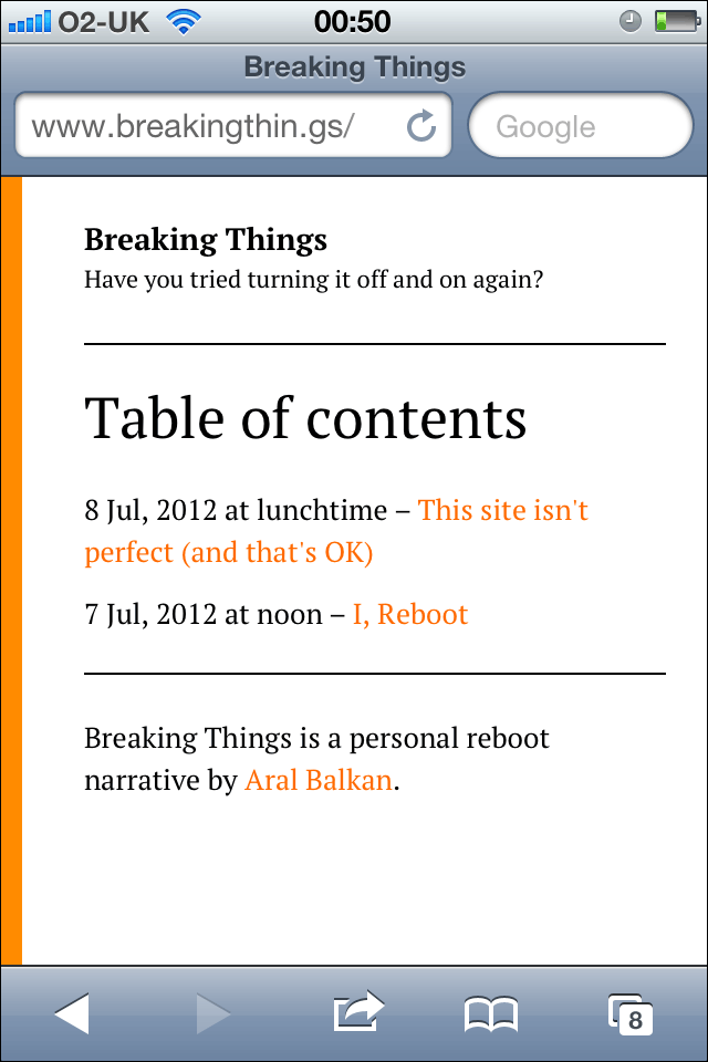
And here are the after shots, starting with the table of contents:
And that first article, again:
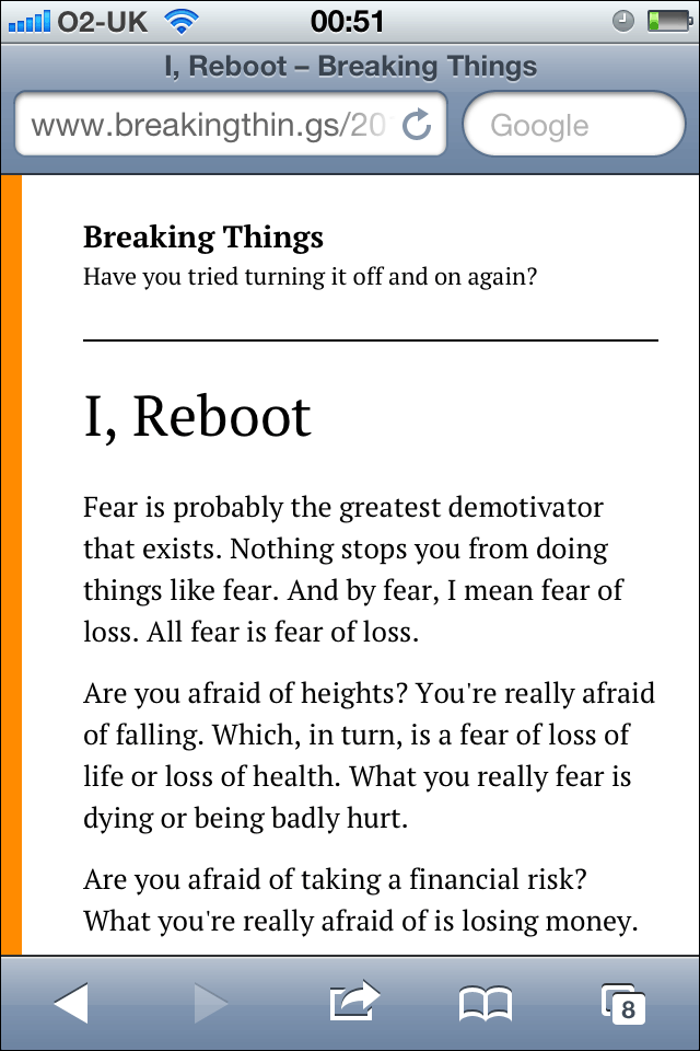
That’s a bit more like it. At least you lovely folks won’t be straining your eyes to read my chronicles on your mobile phones.
My personal reboot isn’t about the development details of this site, but this site is part of my personal reboot so I might — from time to time — talk about it in passing with posts like this one.